Hilda’s Plant and Potions
A plant shop that also carries oils, perfumes, crystals, candles, hosts tarot card readings in back room. A small team of three run by women of color who resides in New York City.
Deliverables:
Logo, Social Media graphics (Instagram), Website, Business Cards, Signage, Bag
Client Brief
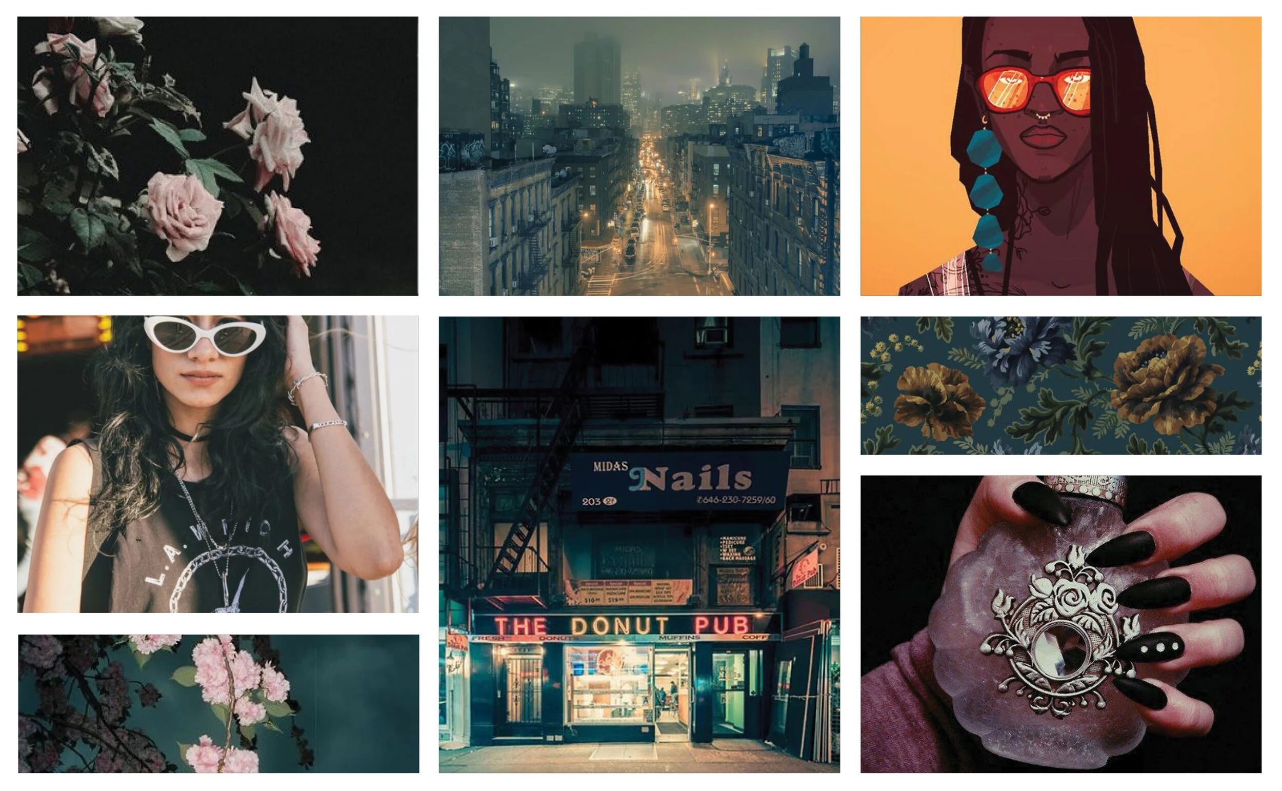
“Dark and witchy aesthetic (but don’t DON’T lean into evil/satanic). Contemporary without looking like everyone else. Potentially feminine leaning, but definitely not necessary. Feminist POC led / Feminist inspired. City/urban aesthetics combine with traditional home remedy/holistic/self care/ancestral/horticultural vibes. Please do not use graffiti, cityscape based imagery.”
Keywords:
Witchy
Urban
Horticulture
Logo Process
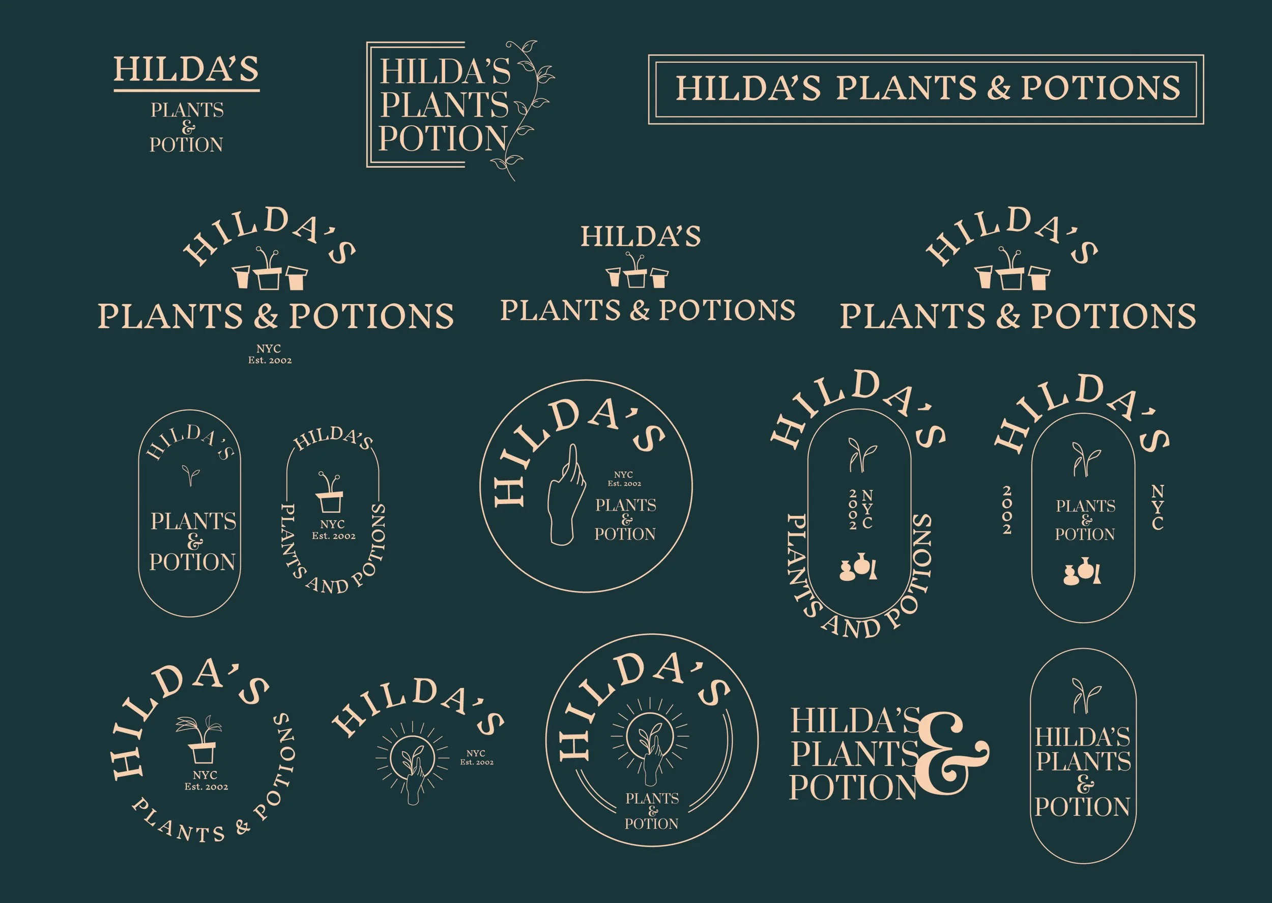
The logo creating process involved figuring out how to combine a “witchy”, mystical aesthetic yet simple enough to translate into digital and physical signage. The goal is to make sure this logo is very versatile and be able to constantly be replicated and evolve with offerings this company decides to do in the future.
Deciding to go with the pendent shape with a hand won out for its ability to be simple, versatile and uniqueness. The hand symbolizes the physical labor of those who started and built this store as well as a symbol that can be made to organically hold something while the words below can be swapped out with appropriate labels and titles. The pendant shape is mean to indicate a sign outside the shop which is very similar to how pop culture references ‘witch-y’ shops.
Qualities of a Logo
Easy to replicate across platforms
Evolve with Time
Easy to understand

