Kaisa Collection
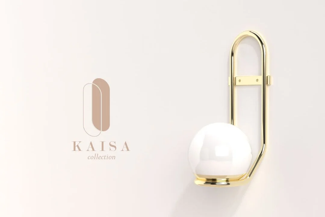
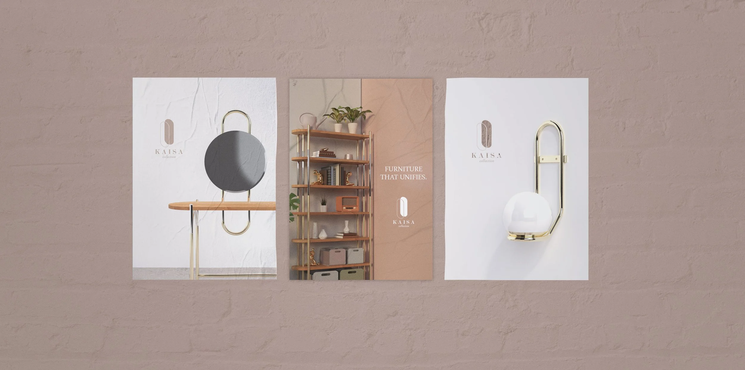
Kaisa Collection is collection of furniture designed by Katrina Monreal. This collection speaks to the union of oppositional forms in the furniture pieces. Shine is very prominent on these objects where the curves accentuate it when light hits it. Thin metals and flat food create something lightweight and effortless. The furniture have various materials that fit together to create a polish and elevated look.
This is a project to create a cohesive brand identity and an ad campaign to promote these products.
Deliverables:
Logo + Brand Identity
Social Media campaign (Instagram)
Business Cards & Brochures
Packaging
Posters Campaign
Client Brief:
Create a brand system and an ad campaign to promote this furniture collection by a small designer.
Audience: 20s-late 30s
Feel: Elevated, not cheap; “affordable luxury”
Stand out amongst existing women facing furniture markets
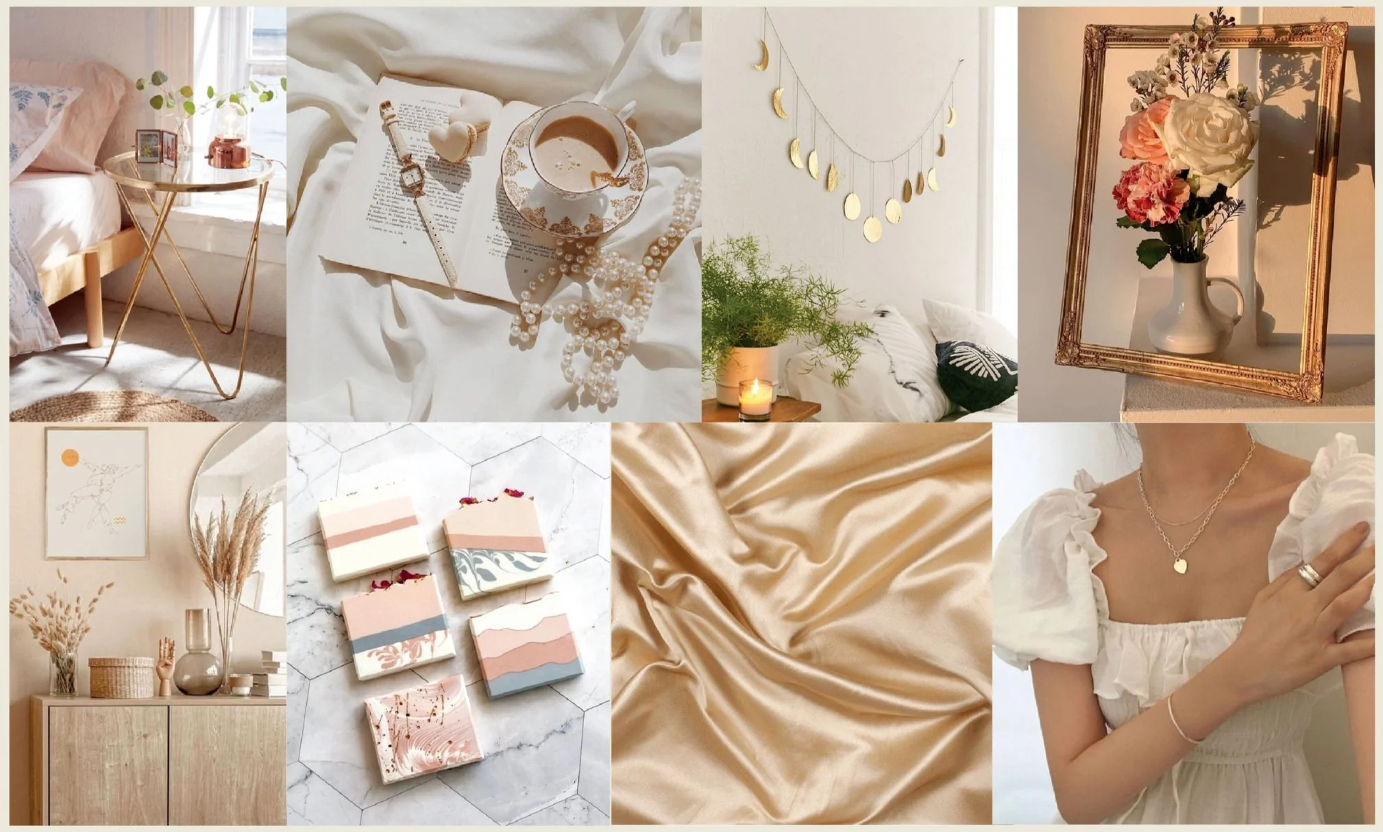
Suggested colors: yellow ochre, light pink, grey, tan, white
“Make it pop”
Keywords:
Polished
Delicate
Metallic/Shine
Feminine
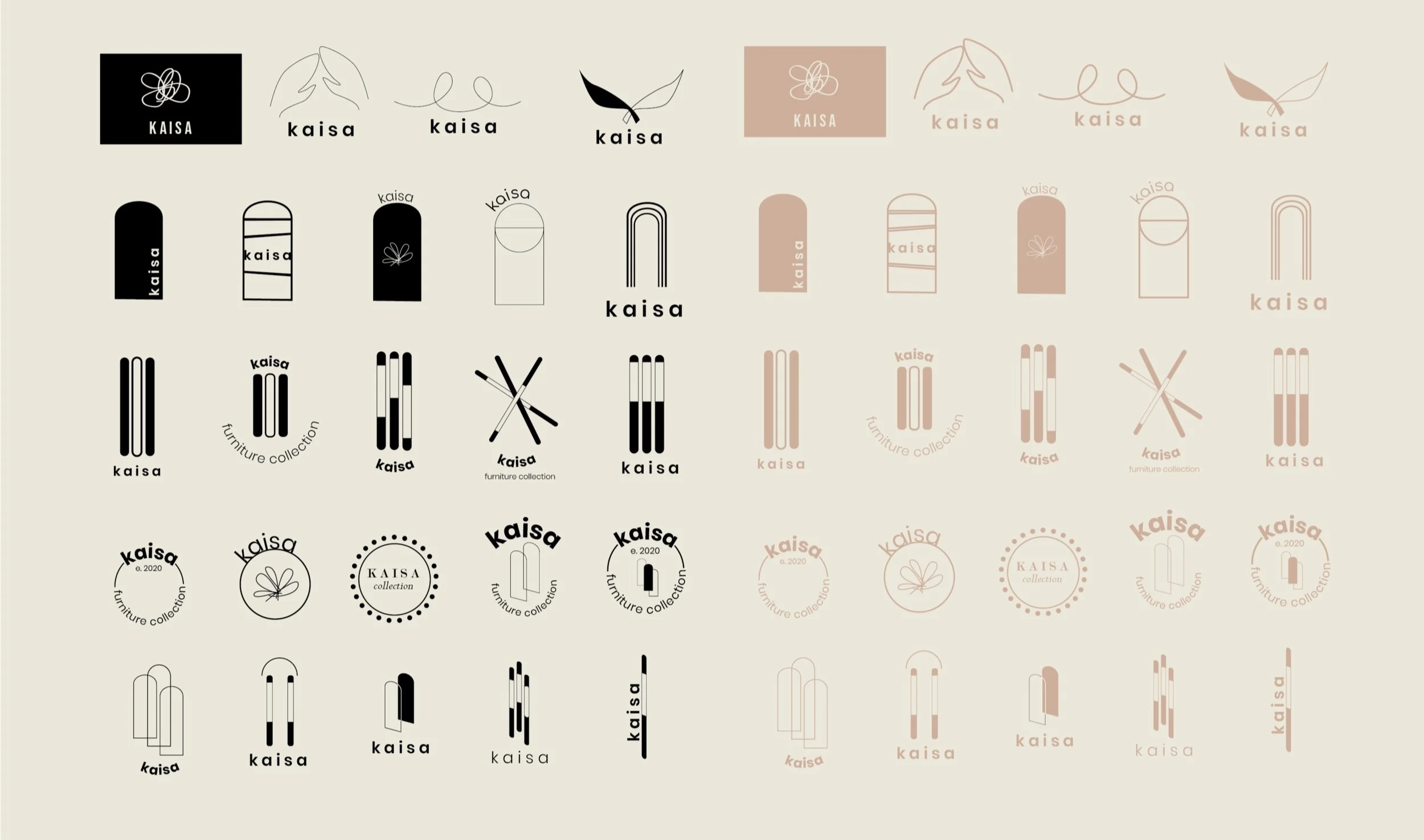
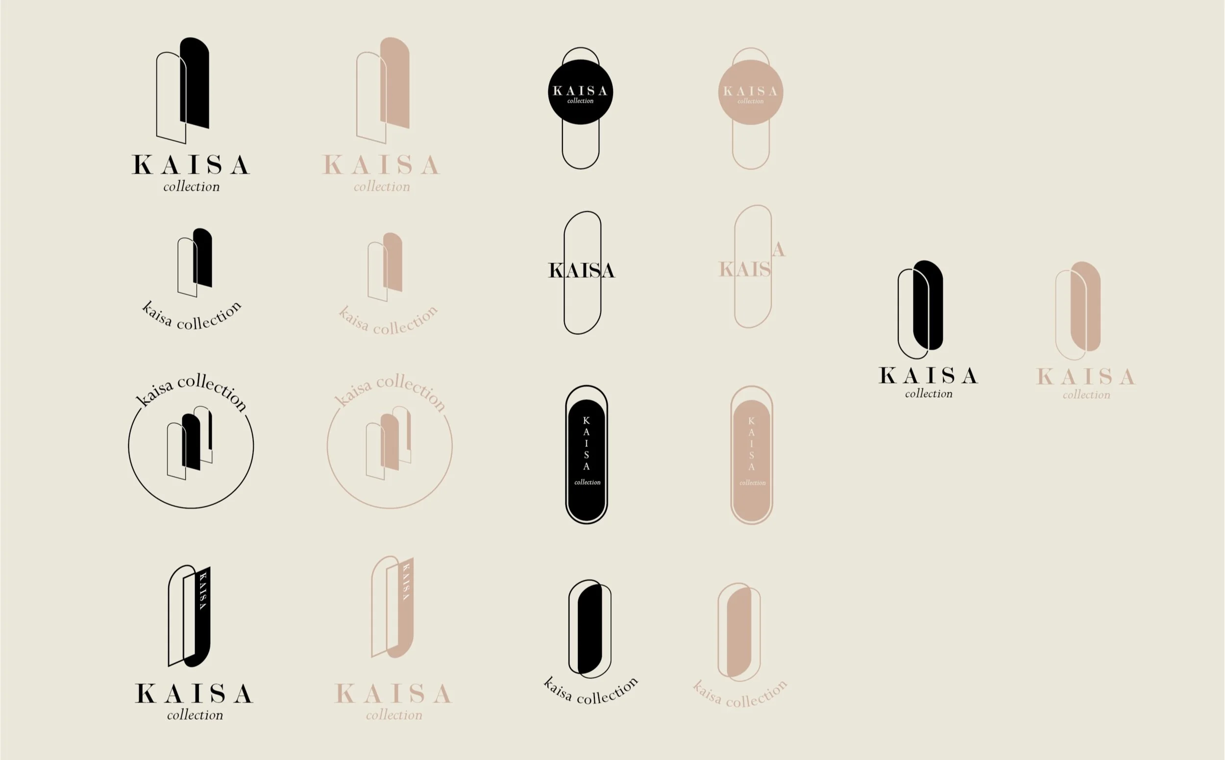
Logo Ideations:
The logo inspiration board looks at the various symbols and expression marks that may be incorporated into Kaisa. These logos were chosen for their simple and charming design. Elegant and calm are also pronounce in these.
