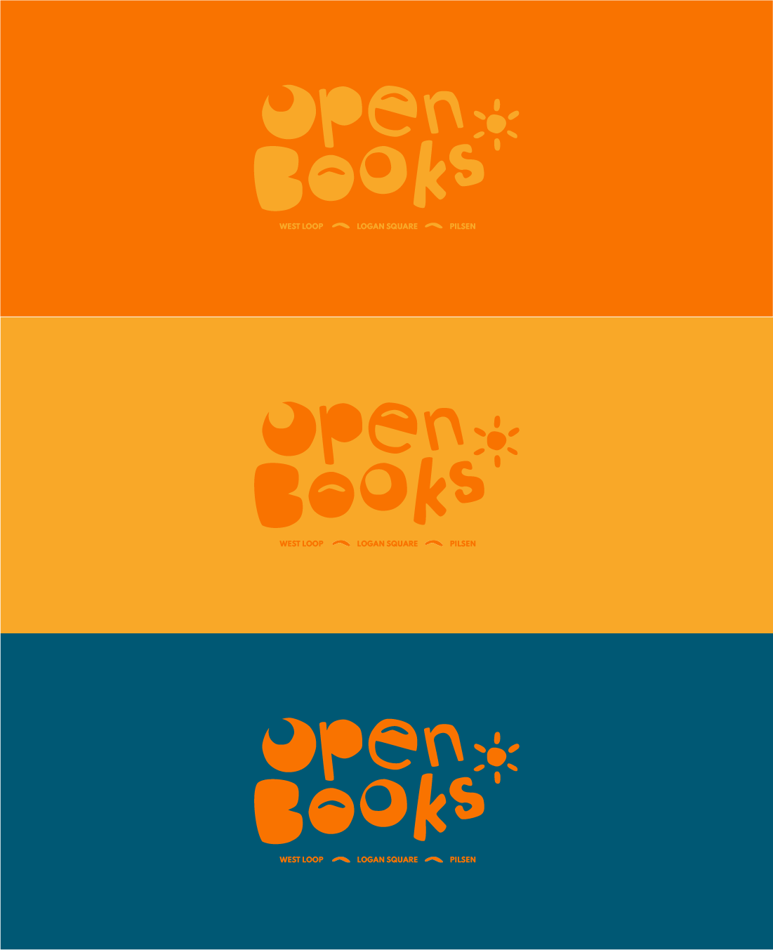
Open Books Branding
Open Books a non-profit that provides literary experiences for students, educators and patrons across the city of Chicago. They strive to enable and create an accessible space for anything related to reading and learning. To fund these programs, they sell donated used books in West Loop, Pilsen and Logan Square and through their online store.
Disclaimer: This is a project for exploring an organization I admire and creating an identity with my own research and no way affiliated with Open Books.
Deliverables:
Logo & Color Palette
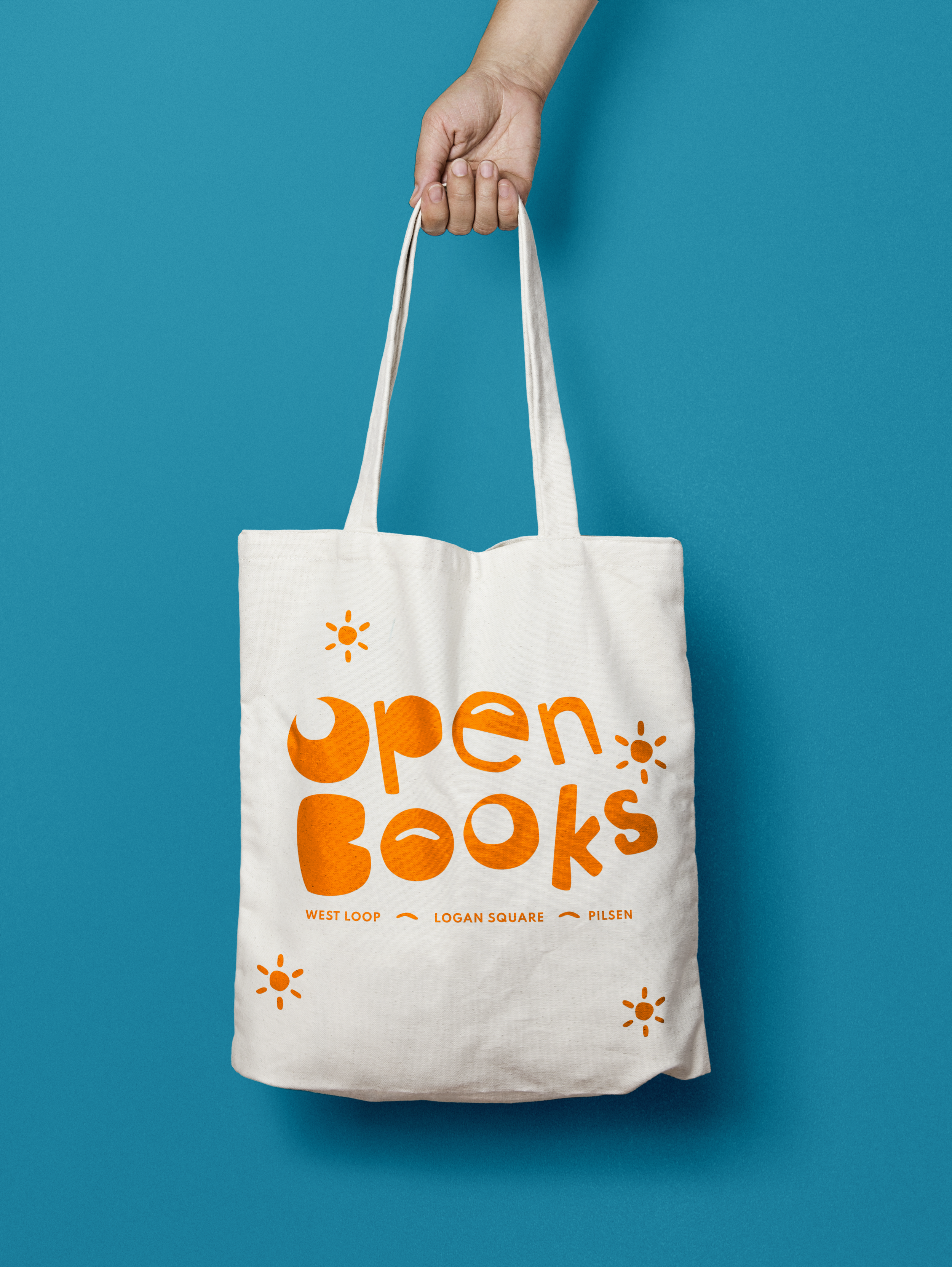
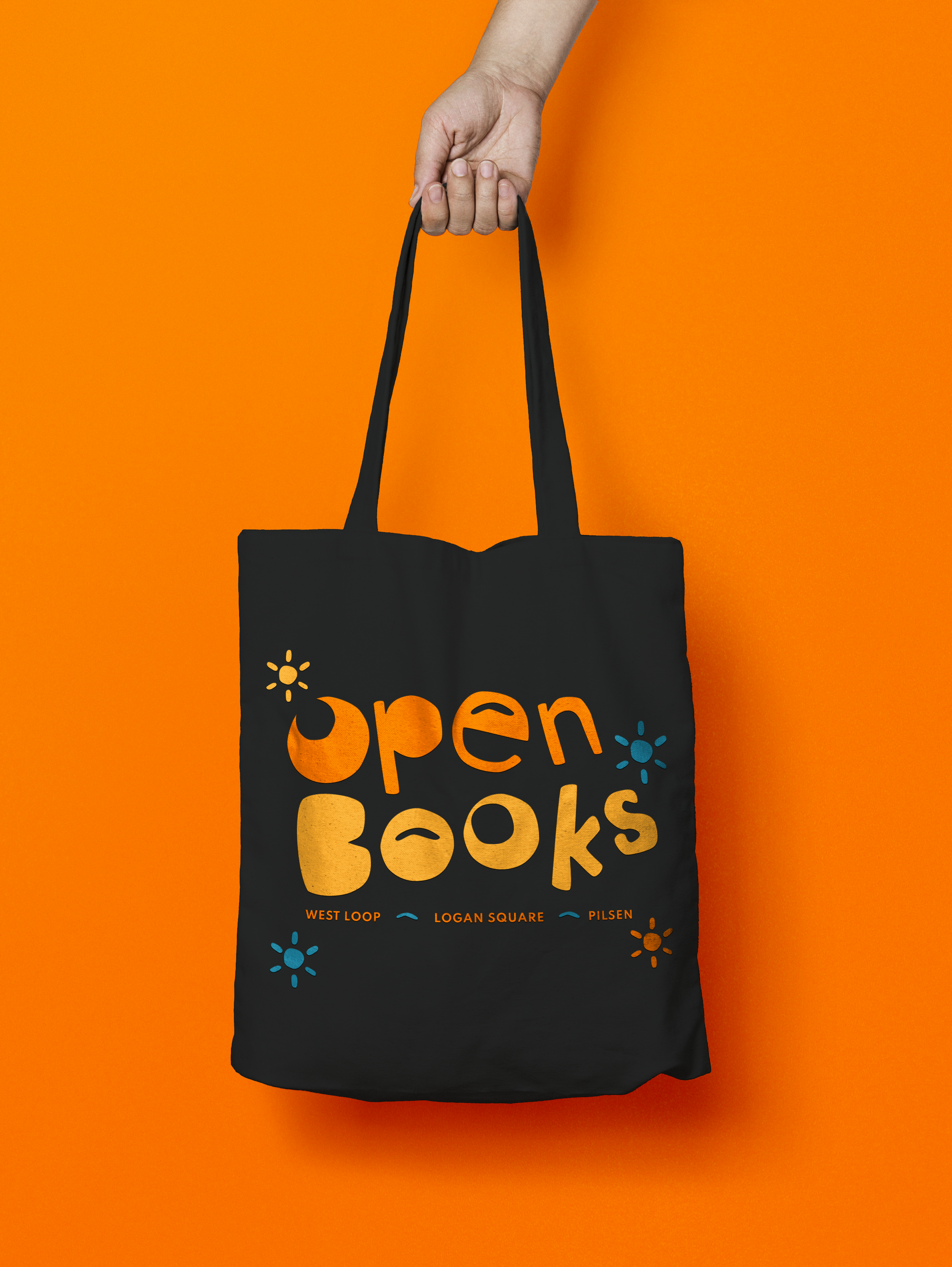
Merchandise (T-shirts, Tote Bag, Stickers)
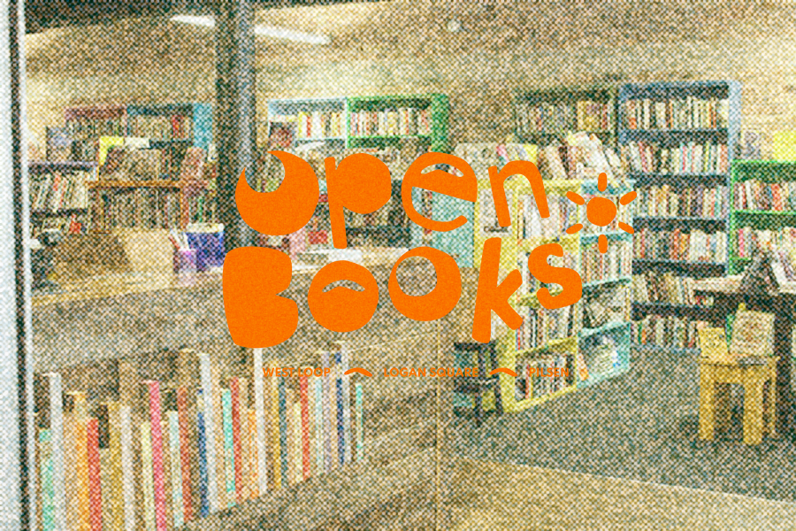
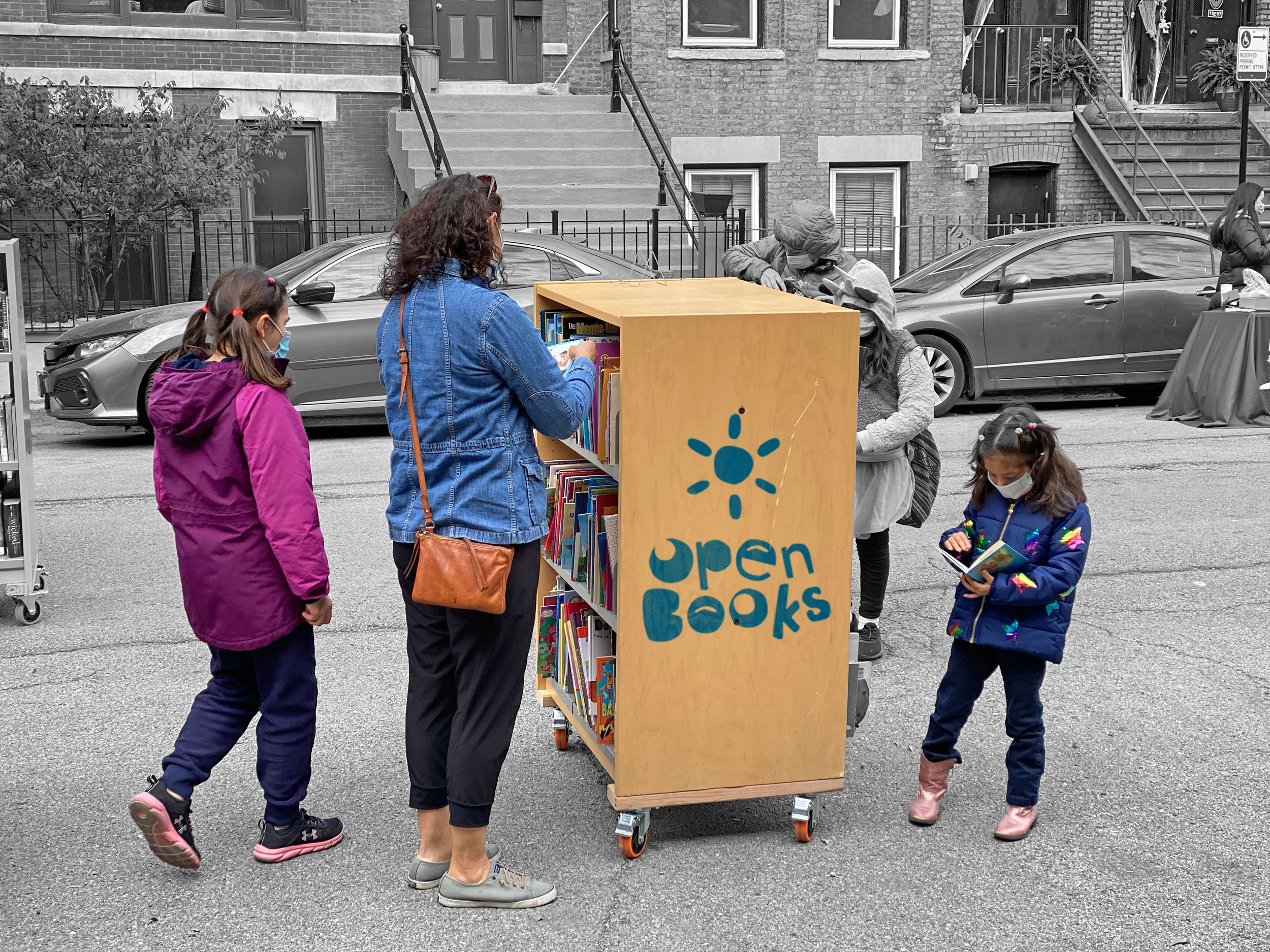
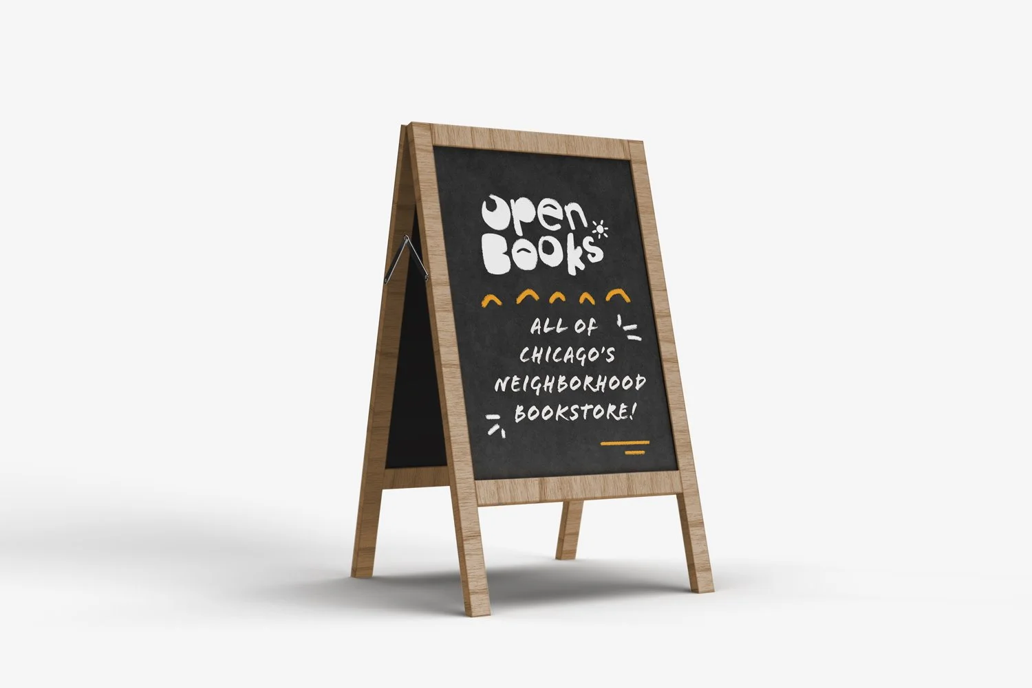
Signage & Cart Design
Social Media (Instagram)
Online Store & Website
Visiting an Open Books store is very welcoming and bright space where the main focus is on the books and the adventure of finding titles that you might not expect. The logo and the language describing this space should reflect what it feels like to visit a store so the goal with this branding process is to create a system that is digital and print friendly, provide a clear and bold mark and captures the character of this book-centric organization.
Logo Ideation
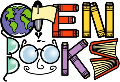
While ideating logo ideas, the best course of action was capturing the character of this store. The original logo has so much personality and really emphasized on books, so this new iteration meant taking those qualities and finding a stronger mark, less intricate yet holds the same playful design. This new design would use the shape to speak for itself rather than provide a literal message with the logo.
The words used to describe this brand is
Helpful
Quaint
Splendid
Original Logo


