Soja Branding
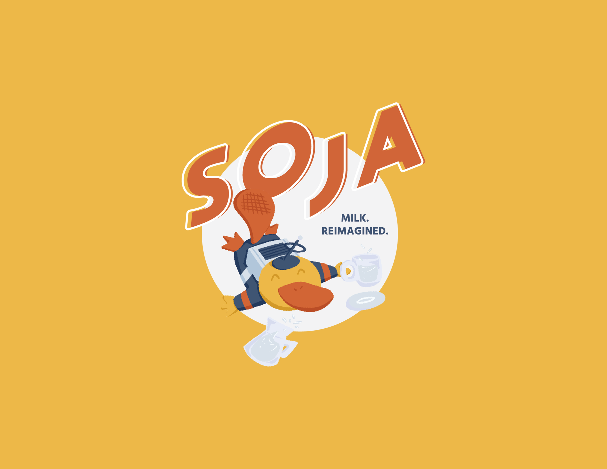
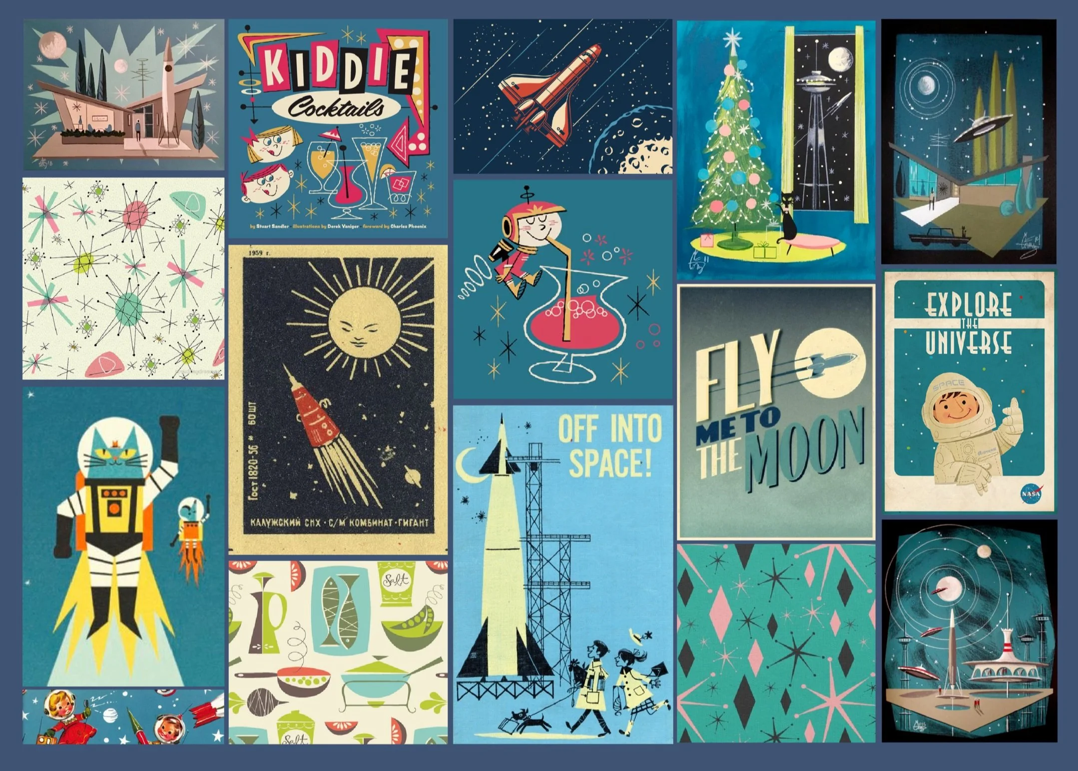
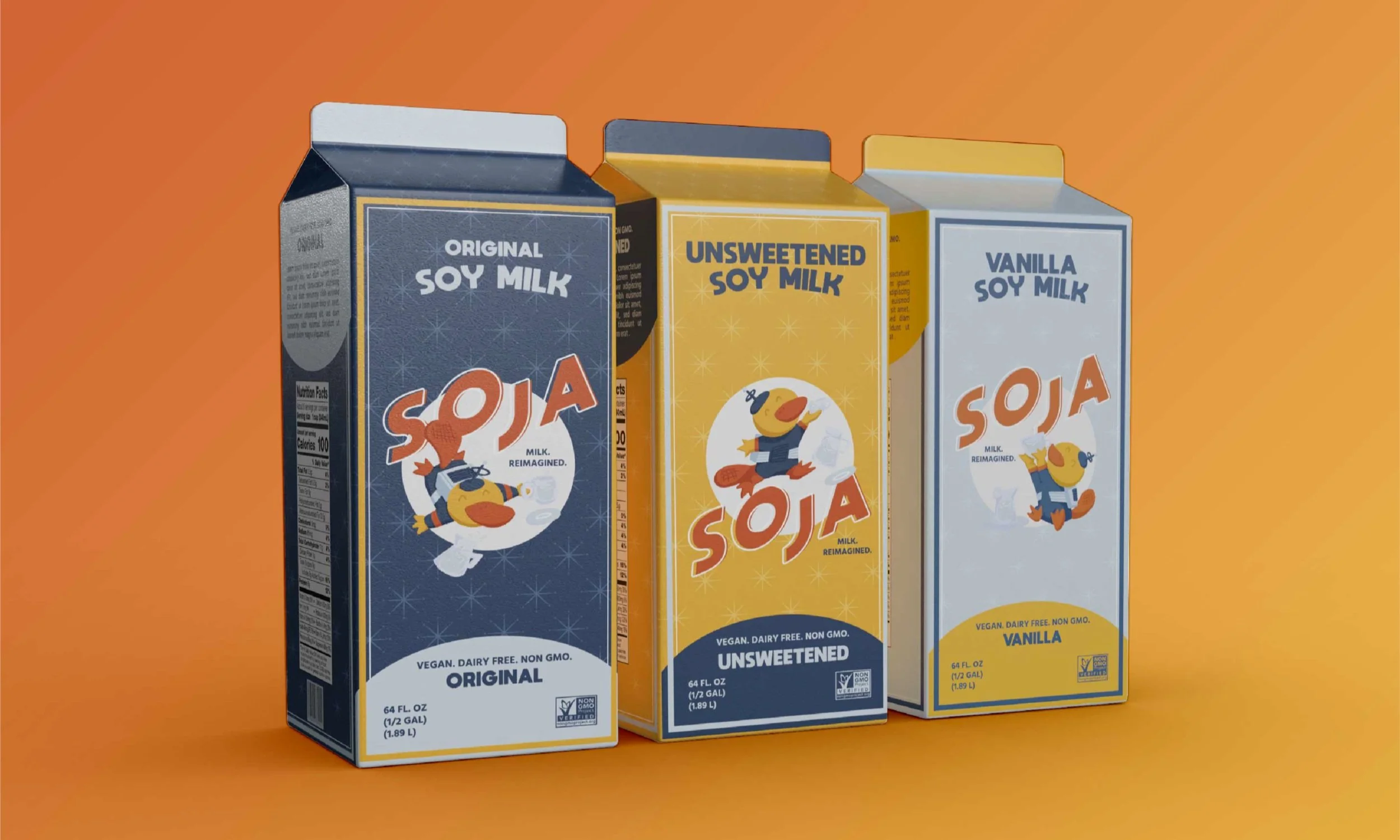
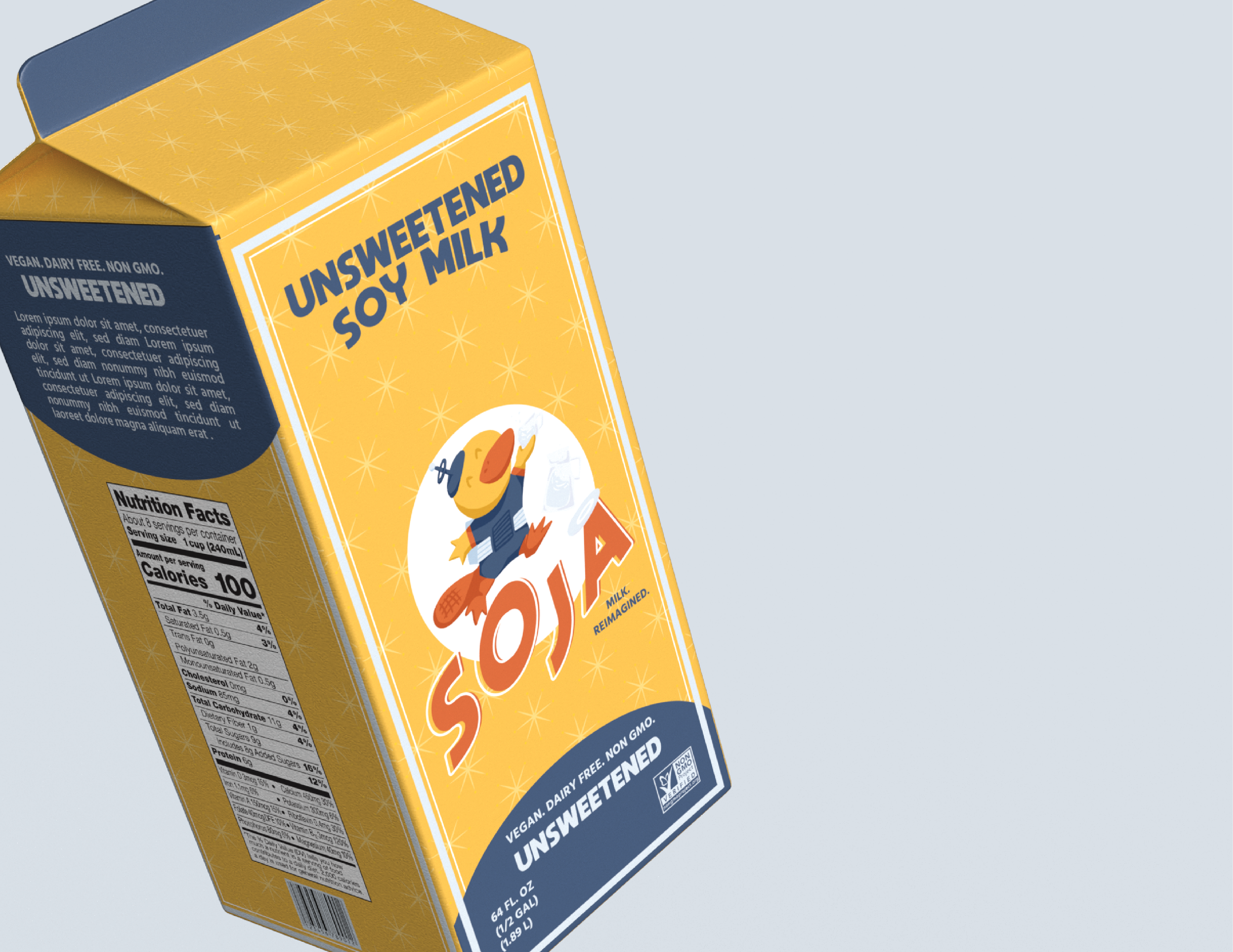
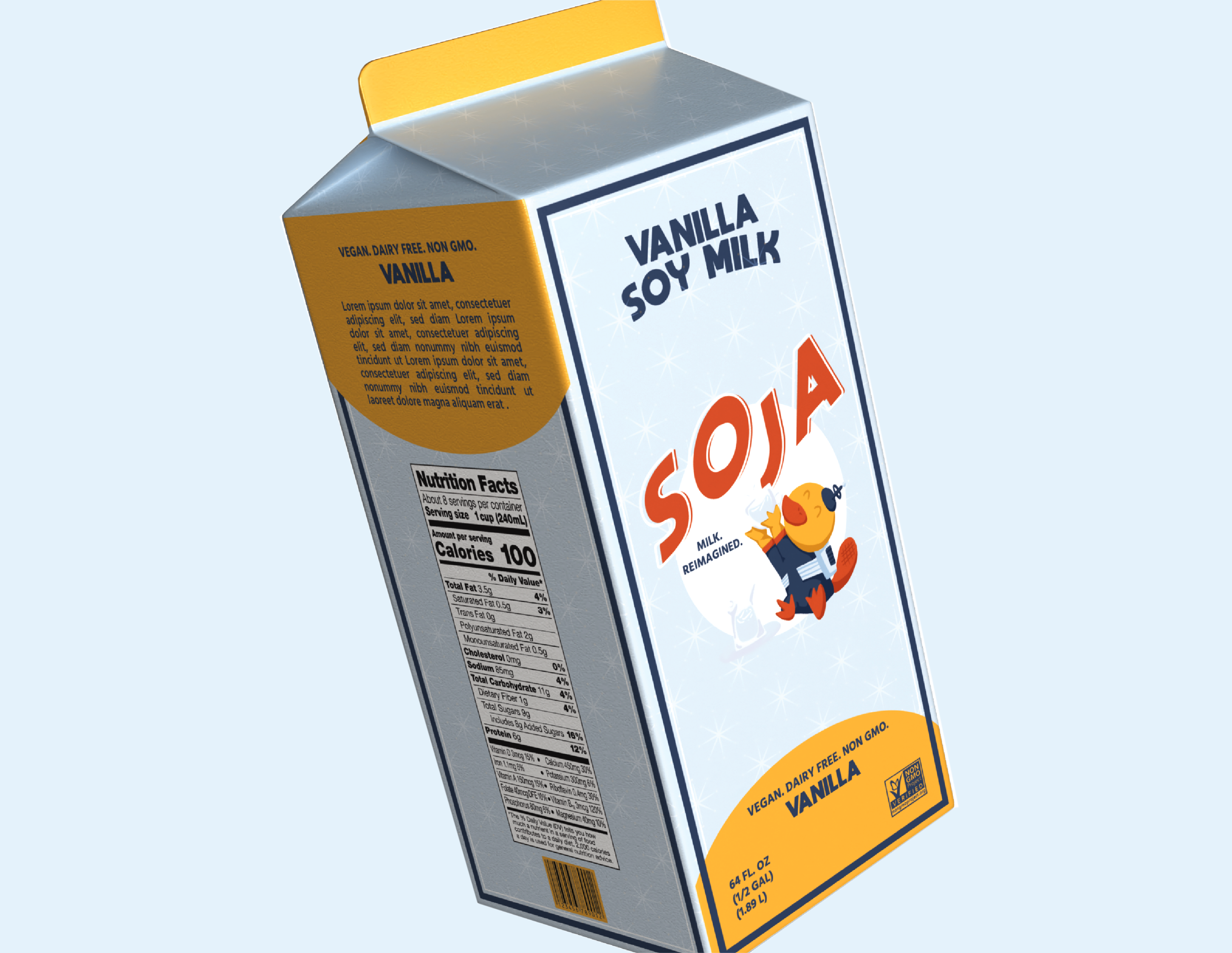
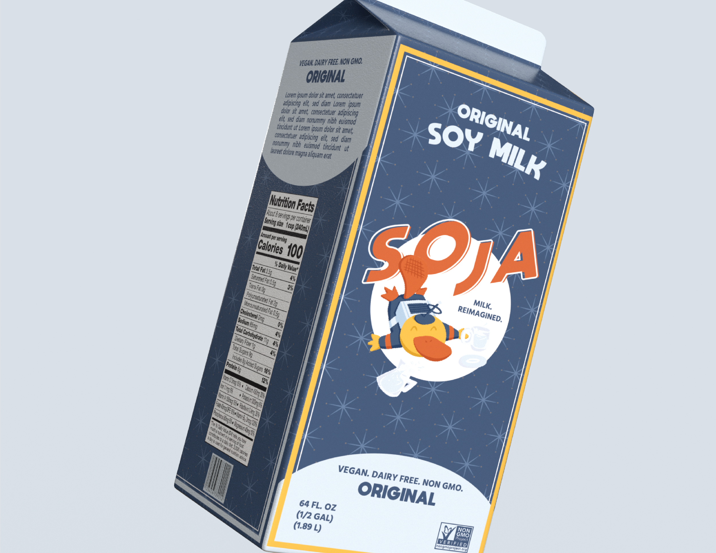
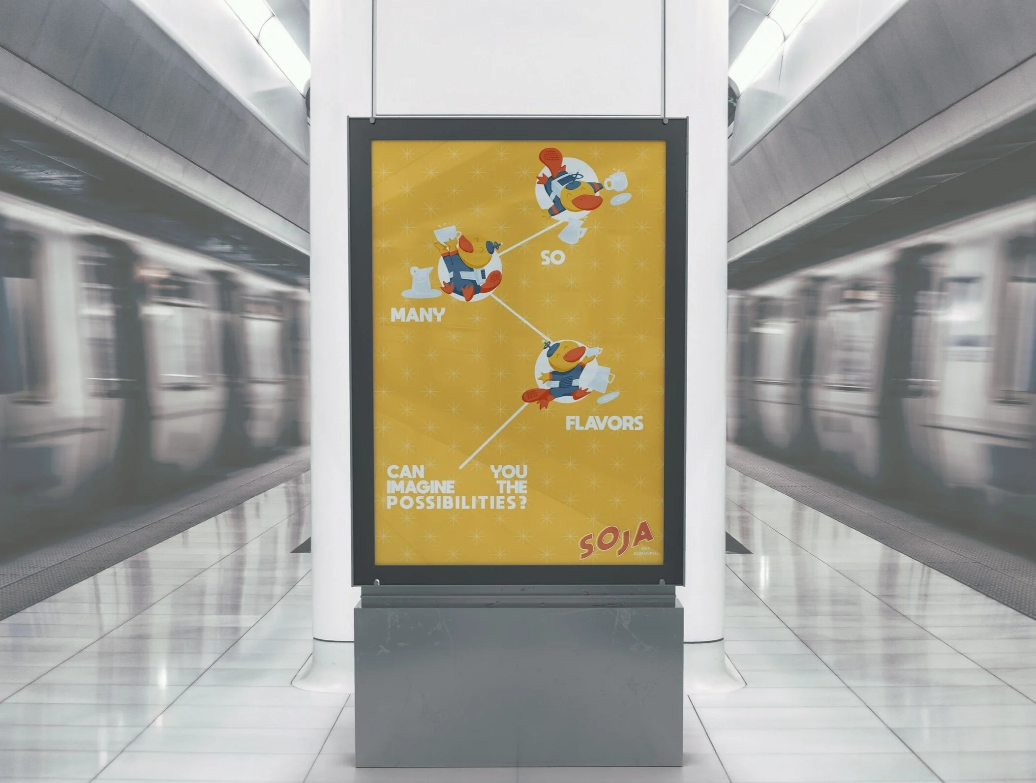
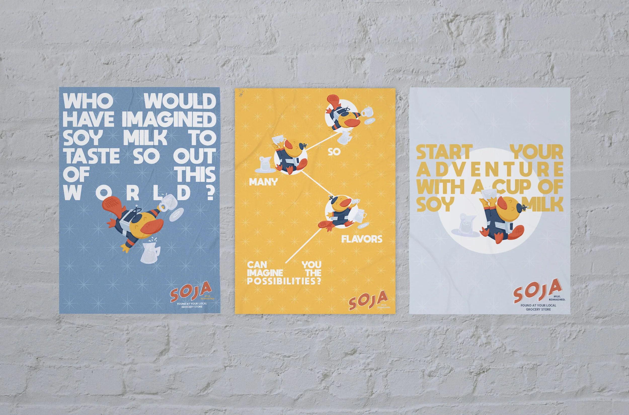
Soja is a milk brand and their Moto is “Milk. Reimagined.” The identity stems from what “reimagined” could mean. Tying themes of space exploration that was popular in the 60s with retro elements and a carton mascot. Soja became a brand that evoke childhood imagination that appeals to older audiences who needs a reminder of their imagination when they drink this beverage.
Deliverables:
Logo, Brand Identity, Illustrations, Beverage packaging, Poster ads, Merchandise (t-shirts, collectable posters)
Client Brief:
Client had a very detailed brief of how they want their brand presented and designed. To beat competition and become more than just a milk alternative beverage, this brand identity must incorporate a lifestyle aspect to further encourage buyers to subscribe to this product. A mascot that is spaced themed was one of the few things that came to mind to give this brand a unique identity.
Keywords:
Energetic
Retro
Playful
Logo Ideations:
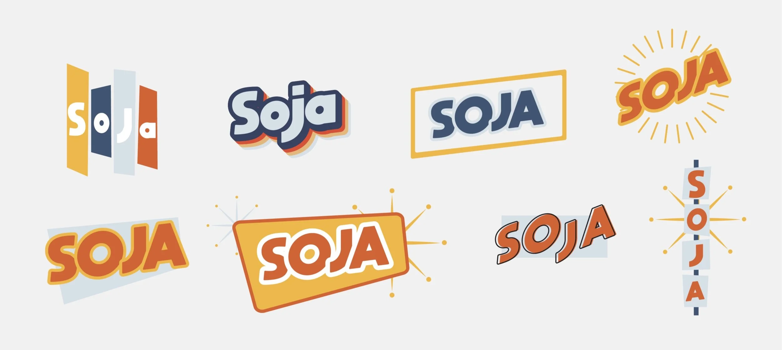
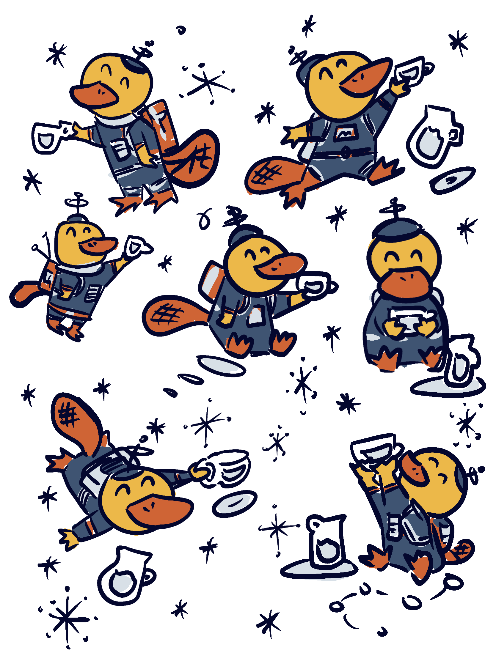
The logos were inspired by retro 60s and 70s signage. Most of the designs mirror those found in diners or drive-ins. The mascot idea was to help people remember this brand better. Cartoons are a staple of an American childhood so creating a playful and energetic character will further evoke imagination and nostalgia.
“How might we design a beverage brand to evoke imagination in adults?”
Final Thoughts:
Tying themes of space exploration that was popular in the 60s with retro elements and a carton mascot Soja became a brand that evoke childhood imagination that appeals to older audiences who needs a reminder of their imagination when they drink this beverage.
“We are limited only by our imagination and our will to act.”
-Ron Garan
